Sub-Features Apps: announce & aura
At Evolv, we created a main safety app called Eva. I was tasked with building and helping to create two sub-features called announce and aura. I have placed both here; you can click aura above to jump down.
announce
Designed and researched a sub-feature called “announce” which enables administrators to broadcast emergency notifications directly to staff members.
Overview
Evolv Technology is a weapon detection company outside Boston, MA. Their main product is a tablet that the guards use and the portal that admin see. I led the ux research being done, while helping create designs on apps, user interfaces, promotional materials, and more.
Role: Lead Ui Designer, Product Designer
Business Goal
Evolv was launching a new safety application called Eva to support real-time communication and incident response. As part of this initiative, the team needed to introduce a sub-feature called “Announce,” which would allow administrators to broadcast emergency notifications directly to staff. The goal was to design this feature to be clear, immediate, and consistent with the existing Eva app experience.
UX Solution
I was responsible for designing the “Announce” feature end-to-end. Starting from information architecture and user stories, I defined key user flows and collaborated with cross-functional teams to ensure visual and functional consistency with the parent app and Evolv’s broader product ecosystem. In Figma, I created reusable components, variants, and interactive prototypes to illustrate real-time notification behavior and confirm usability across devices. The final design delivered an intuitive and scalable solution that enhanced communication efficiency during critical safety events.
Client: Evolv Technology
Tools: Figma
Duration: Fall 2024
Design Process: Competitive analysis, personas, use cases, user flows, wire framing, & more.
Phase One: Research
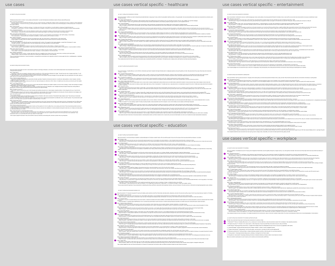
Starting this process I started with researching use cases in our verticals. If we are to design something for users to use, we need to know what they need to use it efficiently. Why would they use it, how would they use it, etc.
Then I looked into competitors to see how we can be different and stand out. To make sure we are designing for what users want. We wanted to be clear, concise, very easy to use/understand.
Next, I created personas and use cases. Needed to see who would be using our product and how they would be using it. From this, we figured out what information was needed, and found more flow we did not initially think of.


Phase Two: Design
With all that research under my belt, I could now start designing. Here are some quick wireframes that I made.
Here are some initial designs. Where I was taking inspiration from our main app Eva. While creating these screens I came up some with initial questions.
“Can we say ‘Check-In’ when that is one of our main features?”
“What will the text be saying and how it is getting there?”
“Does the app determine the threat level?”
“Can they exit or do they have to click a button?”
Latest Designs
After creating designs and gaining feedback from my fellow designers here is where I finished.


Reflections
Annouce Future
For announce’s future plans currently it is not out, since our new CEO wanted to postpone all new designs.
Personal Reflections
This project was especially rewarding because I was able to take full ownership of the design process—from initial concept through final delivery. While I collaborated with coworkers for feedback and validation, having the opportunity to lead the project independently allowed me to make thoughtful design decisions and see them through to completion.
An exciting outcome of the design process was the creation of a new sub-feature called Roll Call. As we focused on keeping the experience simple and intuitive, the idea emerged to give staff an easy way to check in—a lightweight feature that enhanced the overall usability of the product. It was a great example of how thoughtful design exploration can lead to valuable new functionality.
☆☆☆☆
aura
Update all the screens to align with our parent app Eva (main safety app). I built out components, variants, and interactive prototypes in Figma to enhance consistency and functionality.
Overview
Evolv Technology is a weapon detection company outside Boston, MA. Their main product is a tablet that the guards use and the portal that admin see. I led the ux research being done, while helping create designs on apps, user interfaces, promotional materials, and more.
Role: Ui Designer, Product Designer
Business Goal
Through customer feedback, we identified a critical gap in how teachers and school staff communicate during real-life safety threats. Existing systems did not provide clear, timely information about where the threat was located, who was safe, or whether it was safe to move. The goal was to create a solution that improved situational awareness and communication efficiency during emergency events—while maintaining consistency with Evolv’s main safety app, Eva.
UX Solution
I was responsible for continuing the project from a previous designer and updating all screens to align with the Eva design system. In Figma, I built out components, variants, and interactive prototypes to ensure visual and functional consistency. My work focused on refining layouts, improving usability, and enhancing overall design cohesion so teachers and staff could quickly access critical information in moments of high stress.
Client: Evolv Technology
Tools: Figma
Duration: Summer 2024
Design Process: Competitive analysis, personas, use cases, user flows, wire framing, & more.
Phase One: Analyze Designs
I started this process by going over the current screens I was given. Comprehending them and seeing how they worked.
The next step in my journey was to start making it uniform with our main parent app, Eva. On the right, you can see what Aura needs to look like. For Eva, we designed an Eva 1.0 simple for the developers, then we also had an Eva 2.0, which I also have to match, seen below.


Phase Two: First Iterations
The first iteration we see came from matching the styles above. The colors, stylistic choices, spacing, & typefaces were all matched here to create that consistent feel across the products.
We also have an Eva 2.0 with a little more going on. We wanted aura to also match this stylistic choices for when 2.0 was deployed. I shifted my focused on making Aura match this style.
With matching Eva 2.0, the principal user was now able to access quick lockdowns that needed to happen ASAP, taking less than 30 seconds (Left 2 images). As well as having a way for the user to send out all the information needed, allowing them to take a little longer but more informative (Right image). As you can see, we are still matching the look and feel of Eva 2.0, but with the information for Aura.
Latest Designs
Continuing with those iterations, here are more of Aura matching Eva 2.0 designs. View the similar landing pages. Similar flows and interactions as well. We really wanted it to be as consistent as possible.

Reflections
Announce Future
This is where we table the designs for now. We had to temporarily pause work on this project for other high-priority initiatives.
Personal Reflections
I really enjoyed working on this project—especially diving into components, variants, and prototyping in Figma. I met regularly with my teammates to gather feedback and ensure alignment as the work progressed. One particularly interesting challenge was figuring out how to display a map within the check-in area. I researched schools of all sizes to understand the variety in layouts and determine how we could represent them consistently—even when their physical structures were completely different. I also explored ways to show multiple floors clearly and intuitively. That’s where I left off with Aura, and I’m excited to continue iterating on this challenge to find a thoughtful solution.
View Eva 2.0 once more below.