Creating a unified experience
Helped redesign and unify the process of applying for a new application thorughout any product. I dove into information architecture and user flows. I contributed by creating and updating over 160 screens across mobile, tablet, and desktop. I also helped maintain the components to ensure consistency throughout. While following our design system.
Overview
Bank of America is a financial institution. They have 300+ designers and I was on a team of 15 designers then worked on pods with 2-3 designers per project.
Role: Ui/UX Designer
Client: Bank of America
Tools: Sketch, Invision, Miro
Duration: 2023 - 2024
Business Goal
How might we unify the application process of applying online for any deposits, credit card, loans, and more. Create the same experience for the users no matter what you were applying for.
Solution
Creating a design system to unify all of the applictions to give them the same look and feel.
Understanding current flow
We needed to find the current experience to see where the gain and pain points are. We needed to see what the customers were seeing, the steps they went through, and what information they were filling out.


Here are the flows that need to be updated.
Looking at Information Architecture
I wrote out every question in Invision for each application and flow. Seeing if the order was the same. If the questions were the same. What information was needed for each application.
I noticed that we had different pre-filled answers for employment in different sections. Some applications required different information. There were a lot of opportunities to make it more consistent.
Personal → Contact → Residency → Employment & Finances → Co-applicant?

Updated Pages
I primarily collaborated with two teammates. The design lead would kick off the initial flows, and I supported by creating and updating screens. We regularly met to review each other’s work, share feedback, and ensure consistency. We also collaborated with the design system team to make sure our designs aligned with system guidelines.
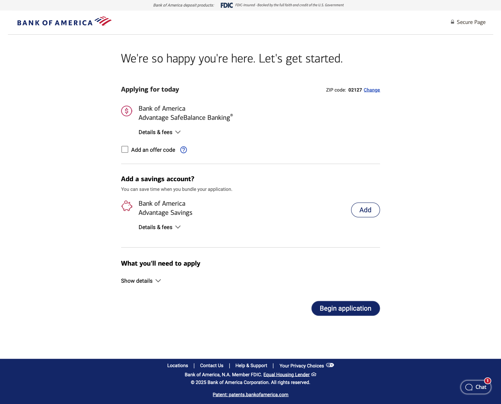
Updated design.
Original design.
Now every starting page will look like this. Content should be either the same or very similar on the pages. We offer you another option (if it makes sense). The layout of the products are the same: icon, name, type, and details and fees. It should feel unified.

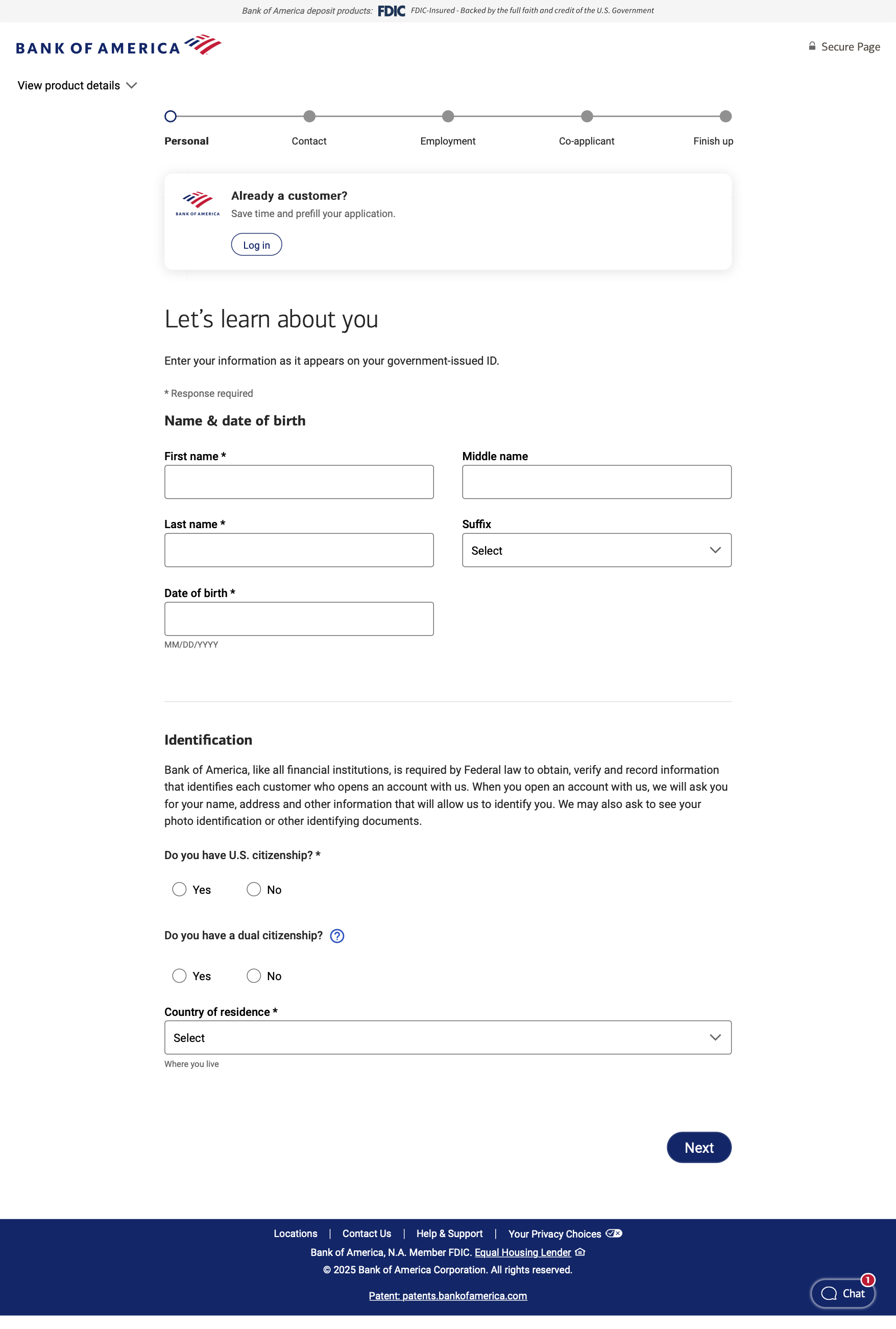
Same thing for the application pages. We added a stepper on top to help spread out the information to not feel overwhelming.
Application Pages
Reflections
Now, users can easily apply for our products through a familiar, consistent process. They can also add or remove additional products with ease, supported by cohesive designs that clearly show these products belong together.
Constant communication is key. When the file is that large everything must be clean and a clear design system. Have fun creating new screens. It will take time but it will be worth it.